
How Usability Testing Improved StreetARToronto's Web Map Beta
Jason Farra
August 20, 2019
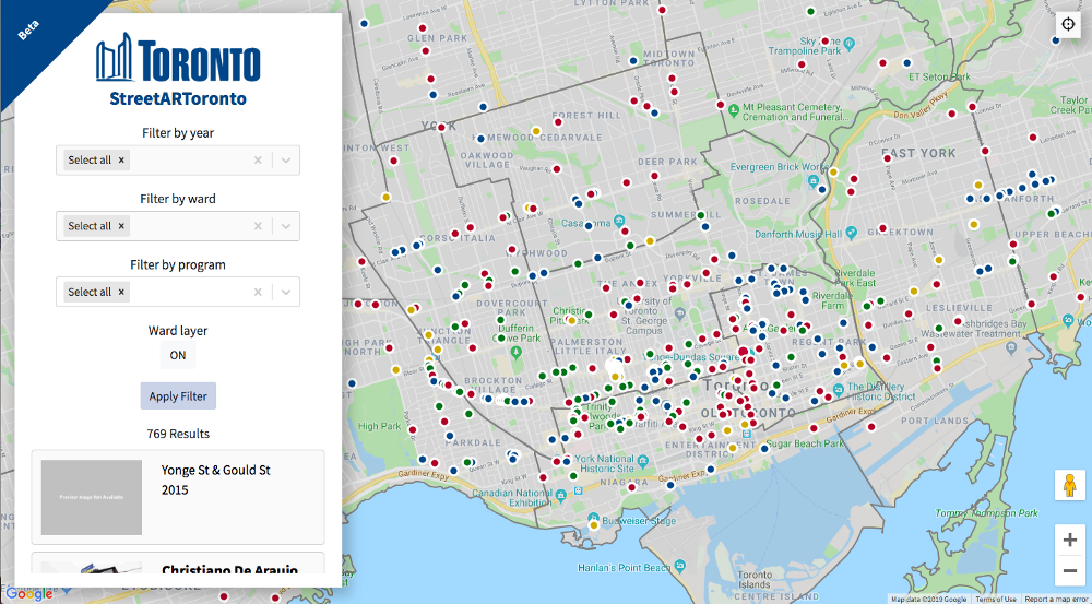
StreetARToronto’s web map features projects that have received support from its Partnership Program, helping residents and visitors search for and browse street art across Toronto.
Read more about the development of the StreetARToronto map here.
After our first usability test of the map prior to its public launch, we conducted a second test — this time of the post-launch beta version. The purpose of this round was to identify further improvements to the map that would make it even easier for people to use.
There were four participants in this round of testing, representing a diversity of ages, genders, and comfort levels with technology.
During the test, participants were asked to complete up to six key tasks using the map on both desktop and mobile — things like finding a specific mural or looking for art located nearby. Proctors from Code for Canada assessed how well users navigated the map, how easily there were able to complete the tasks, and whether they could understand the information shown.
Results
Interface issues
In nearly all of the sessions, the geolocation button was not functioning on both desktop and mobile. Some participants were also unable to find the button when asked to do so.
Additionally, the mobile version had bugs such as the dots on the map not displaying artwork when clicked and the list view not opening and closing properly.
We recommend fixing these bugs and styling the geolocation button to be more prominent.
Filter functionality
Some of the functionality for filtering the artwork displayed on the map was confusing for participants. They found it inefficient to have to remove one filter at a time in order to return to the default state where all artwork is shown.
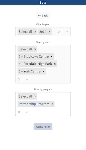
Participants also expected that changing the filters would automatically update the map, rather than having to click the ‘Apply Filter’ button first. The map also did not zoom in on the filtered results and the ‘Apply Filter’ button sometimes became hidden by the filter dropdown menus.
We recommend adding a way for users to reset all of the filters quickly. The ‘Apply Filter’ button could be removed altogether if the map were to automatically update and zoom in on the dots representing the results.
Map and artwork content
Participants found the map dots on both desktop and mobile to be too small and difficult to click on. There are also four different colours of dots, but no clear explanation of what they each represent.
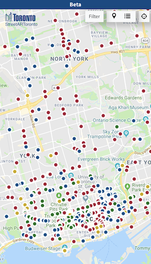
Additionally, when an artwork was selected in the list view, participants expected that the corresponding dot on the map would change in appearance to reflect this selection. Without this, participants weren’t sure which dot the artwork description was referring to.
We recommend making all dots on the map larger and having them change in appearance when selected. We also suggest adding a legend to the map to denote the meanings of the different coloured dots.
Participants found some of the basemap information, such as restaurants and stores, to be unnecessary and distracting. Relatedly, some participants wanted the basemap to show transit stops and stations to help them get their bearings in neighbourhoods they weren’t familiar with.
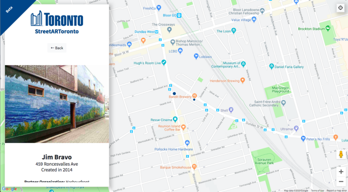
We recommend removing unnecessary information from the basemap and potentially adding transit stops and stations.
Participants also repeatedly came across artworks that didn’t include any images. When images were included, some participants were disappointed that they couldn’t enlarge the images to get a better view of the artwork.
Artwork images should continue to be added to listings that currently don’t have any. If it’s not possible to add images imminently, we recommend adding a placeholder image. We also suggest allowing users to view images of the artwork in a larger format.
Additional features
Participants expressed their desire to be able to filter artwork by artist name, or even by theme or subject matter. They also wanted to have more information about distances to artwork and how to access them by walking, transit or driving.
As this project develops over time, we suggest adding more filters and functions, as well as a Google Maps link for each artwork listing to make it easier for users to access directions.
What we learned
The developer working on the web map was able to observe the test sessions, which allowed them to see first-hand the way participants were using the app, as well as their reactions. The developer commented that being present enabled them to spot things that may be difficult to communicate or fully grasp in a report. This was obviously very valuable for our client, and we’ll encourage developer participation in future tests.
Additionally, while we typically work on a faster timeline than our test partners, in this case it was StreetARToronto working more quickly. When a partner is working in an agile way and eager to make improvements to the product, we want to be able to quickly provide test results while also taking the time to write a thorough and fulsome report. We’re interested in how we can reconcile the two timelines and still meet both of our needs.
Test it yourself
Head over to streetart.to to try out the beta version of the StreetARToronto web map and discover street art near you!
Are you interested in testing a digital service or product with residents? Get in touch to learn more about how our inclusive user research program can help.
End of articles list


