4 Visualization Maps to Help You Start a New Digital Project
Charlotte Secheresse
July 7, 2025
Starting a role in a new organization or on a new project can be overwhelming. We receive a lot of information and meet a lot of people in a short amount of time.
That’s why I often use visualization maps to make sense of the information I learn when starting a new project. It helps me gain clarity and get a better picture of the context of what I’ll be working on.
There are four main types of visualization maps I use to do this. Let’s go through all four.
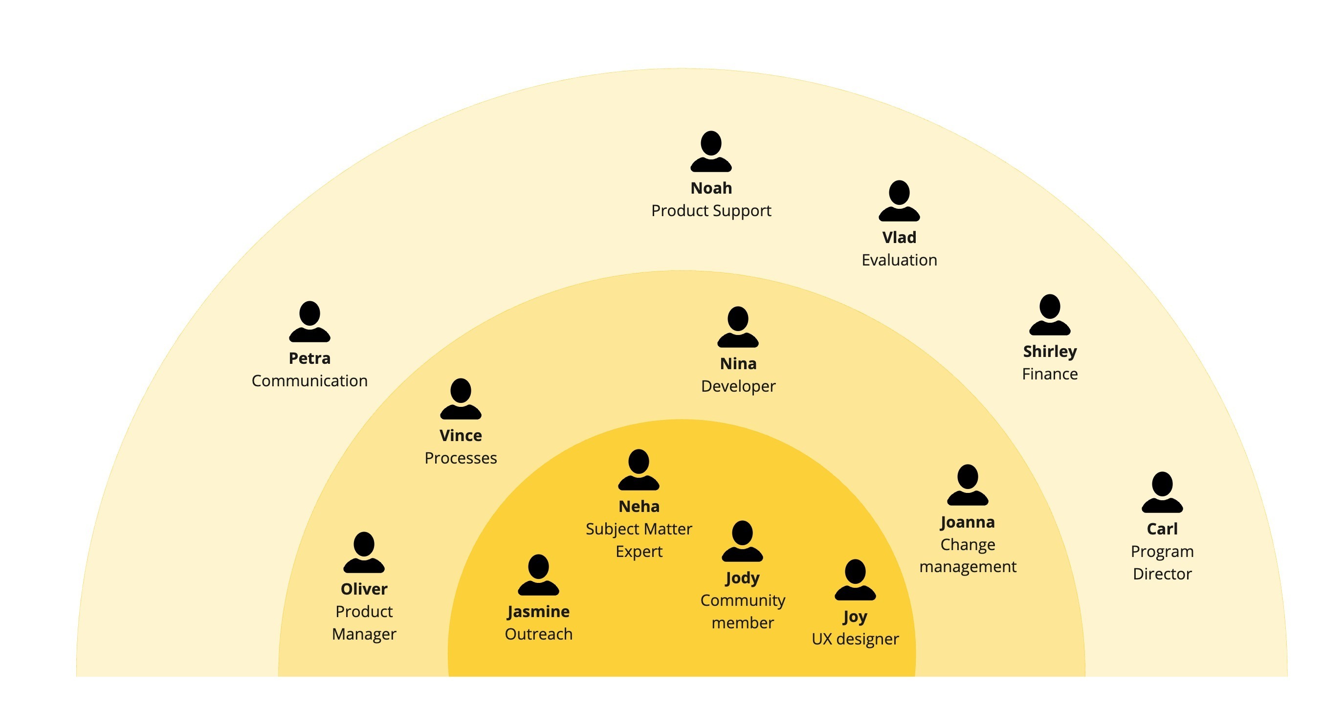
1. Team map
When we start a new role, we’re often given an organizational chart. These charts are great at showing the hierarchical order of an organization or project, but they don’t show exactly how much each person is contributing to a particular project and who needs to be involved.
The purpose of this map:
To gain clarity on the people involved in a project. This map is useful for visualizing the people you meet when starting a project and their closeness to the project.
How to create this map:
Decide on the focus of your team map. For example, it could be focused on the people with whom you'll collaborate to varying degrees. Or, it could be focused on the project and who is core to delivering it, versus who is supporting it. In the example below, we’ll focus on the latter.
Create an inside ring with people who are core to the project. These are the people who are responsible and accountable for it. They are doing the bulk of the work.
Create a middle ring with people who are contributors to the project. These are people you might consult for feedback.
Create an outside ring with people who engage less frequently with the project. These are people you will keep informed.
Taking it a step further:
Colour coding: You can add additional information using colours. For example, different colours can represent different teams, people you’ve met or haven’t met, people with influence, or people who are blockers or champions.
Reflect on who might be missing from this map: Are users and subject matter experts at the core of your project?
Tips:
Write down the name of everyone you meet, then add their role, the team they are part of, and the project they are working on.
You can use a half ring or a full ring, depending on the number of people you have on your map.
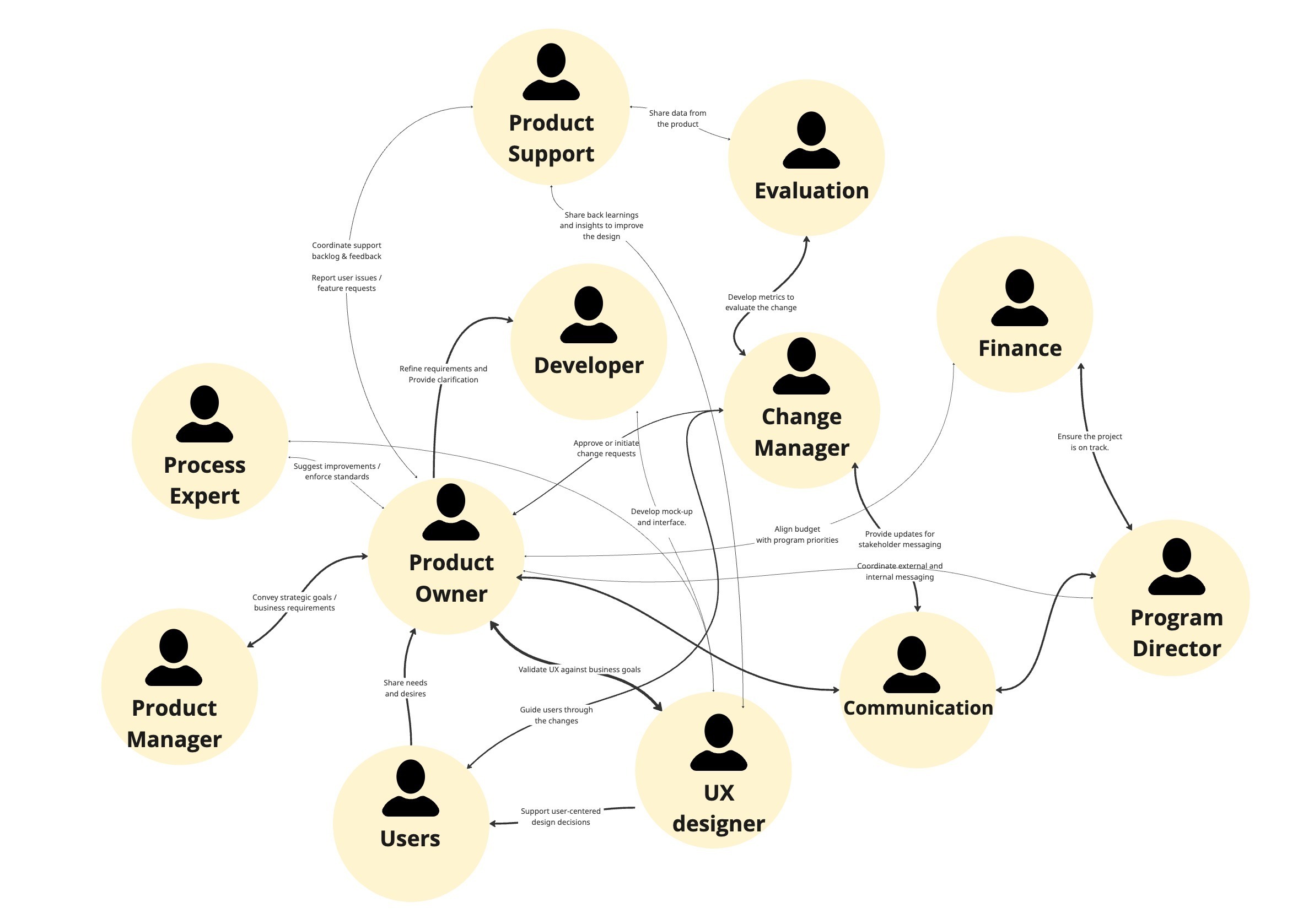
When starting in a new organization or on a new project, it can be difficult to understand different roles and how they connect. This is where a role map can be helpful.
The purpose of this map:
To understand the different roles in an organization or project and how they interact.
How to create this map:
List all the roles in an organization or project (i.e., product owner, product manager, developer, designer, researcher, etc.)
Trace an arrow to mark the connection between the roles.
Write the type of exchange that exists between the roles (i.e., providing feedback, providing mockups, consultation, etc.)
Taking it a step further:
Make the line larger if the two roles are strongly connected — the more interaction and exchange they have, the bigger the line.
Reflect on any gaps: Who isn’t connecting? What opportunities for collaboration might exist?
Tips:
Don’t assume a product owner does the same thing in this organization as in your last organization. Organizations sometimes develop their own version of a role, due to their culture and resources.
Have a one-on-one conversation with people to better understand their roles and who they interact with.
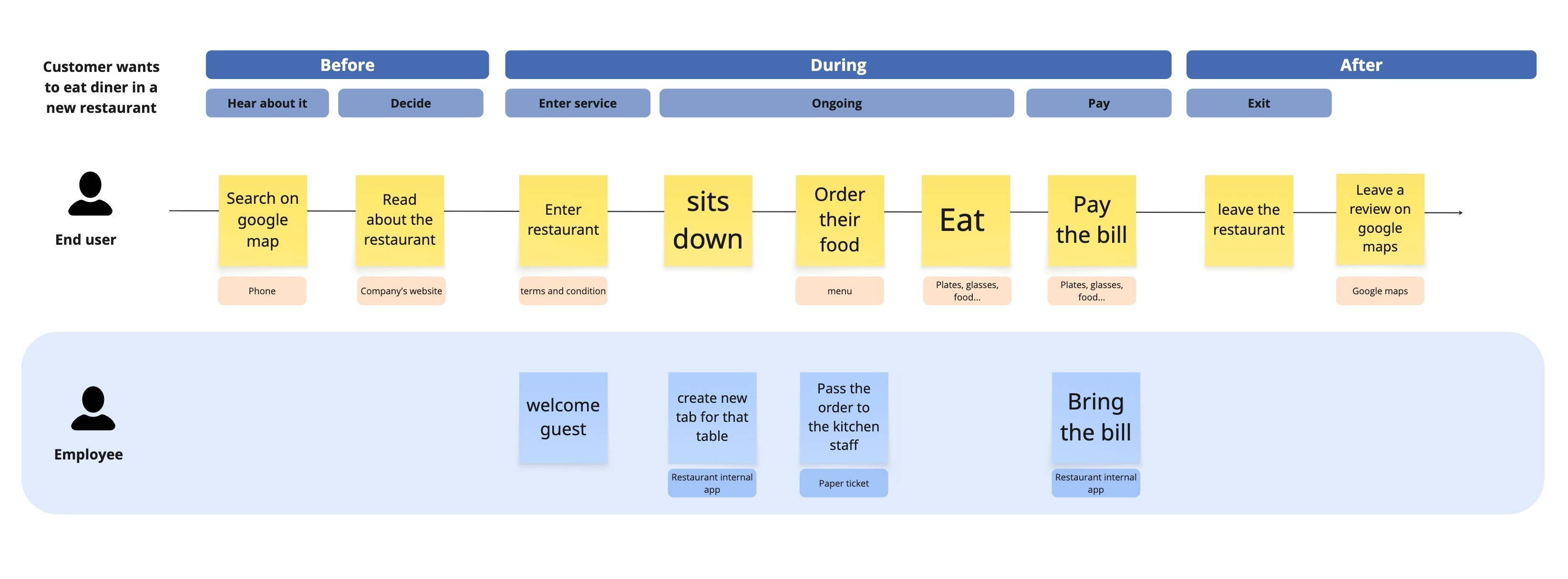
When starting on a new project, I’ll try to gather information about the service and how it works. Drafting a high-level journey map helps me to visualize the information I learned.
Purpose of this map:
To start understanding the overall steps a user takes in a service.
How to create this map:
Start by defining a user group that is experiencing the service.
Write the three big phases of the service: before (a user enters the service), during (a user uses the service) and after (post-service).
Add sub-phases: these are stages like signing up, onboarding, etc.
Add each step a user takes.
Add the people and objects that a user interacts with (for example: a brochure, a kiosk, a website).
Add any backstage interaction, the actions taken by staff or the system that are not visible to the user.
Taking it a step further:
As you learn more about the service and engage with users, you’ll be able to dive into more details.
You may decide to create different journey maps for different user groups if they have a distinctly different experience.
Tips:
Don’t get too fussed about picking the perfect user group
Don’t wait until you have all the information or until you do research with users to get started!
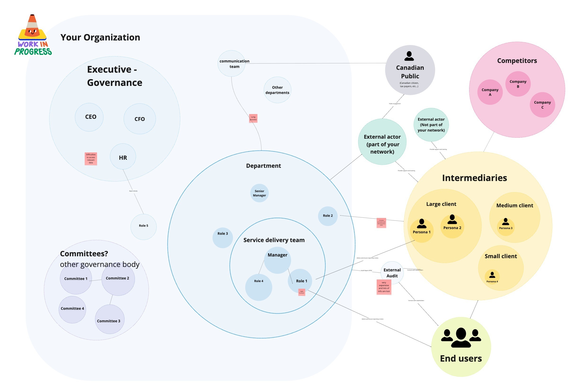
This is my favourite type of map to make — it helps me understand all the people that gravitate around a service, inside and outside of an organization.
Purpose of this map:
To provide a bird’s-eye view of the roles, relationships and influences of the system.
How to create this map:
Identify all the people, organizations and important components of a service.
Trace links to visualize relationships and connections.
Taking it a step further:
Add pain points or opportunities on the map.
Reflect: What connections could you leverage? Who might be acting as a gatekeeper?
Here is some general advice when making visualization maps:
Make a quick sketch on paper first, to help you place things quickly and see if the map makes sense.
Consider using an online whiteboard tool, like Miro or Mural. This will allow you to easily move and place people/roles on your maps and create links between elements of your visualization.
It might take you a few attempts to find the best way to visualize the information you’re trying to understand.
Things change, so don’t hesitate to revisit your maps as you’re learning about the project and the people involved.
And perhaps most important of all: Share your maps with other people on your team! Doing so is a powerful way to test your assumptions and better your understanding of the project. It also helps ensure you're staying aligned with the team on how to make sense of and understand the problems and opportunities of your project.
Ready to test it out?
Creating visualization maps can be a rewarding and enjoyable way to understand the different elements of a new role or project.
Looking for more resources and advice for creating cross-functional digital teams? Get in touch to find out how Code for Canada can help.