GRIT Toronto Test #4: Digital Transparency in the Public Realm
Jason Farra
August 15, 2019
GRIT Toronto is a civic usability testing service that connects technology creators — including governments, startups and civic tech groups — with diverse and underrepresented communities to help test their products. Our mission is to make usability testing more accessible, inclusive and effective.
One of the ways we do that is by working in the open. These regular blog posts open up the black box of technology testing, introducing readers to some of our clients as well as key findings from our tests.
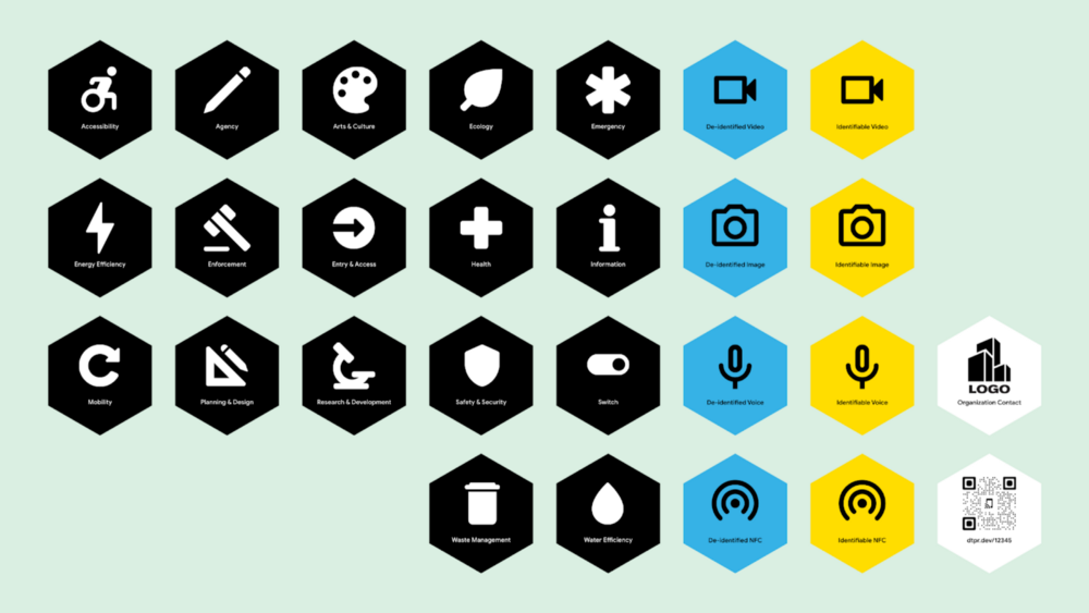
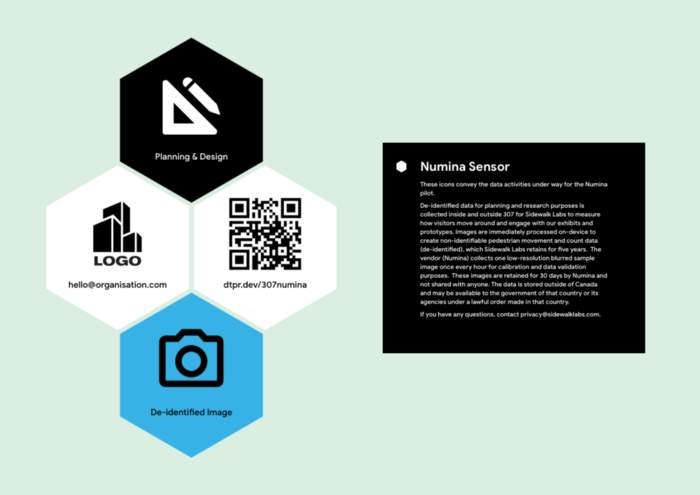
Sidewalk Labs’ Digital Transparency in the Public Realm (DTPR) project has developed a signage system to make it easier for people to understand the use and purpose of digital technology deployed in public spaces. Using a set of icons, the signs are meant to clearly and quickly communicate to passersby about how data is being collected and used.
Development of the project involved an iterative, rapid prototyping method, with multiple points of feedback from both experts and the general public. This included a usability test with GRIT Toronto, designed to assess the legibility and user-friendliness of the first draft of signage. We gathered feedback on the signs themselves, and documented how users perceived them. We also tested a web app, accessed through QR codes on the signs, that provided more information on data collection.
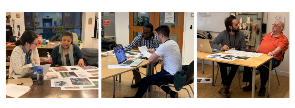
The usability test took place at the Centre for Social Innovation’s Regent Park location with 12 Torontonians, representing 11 different wards across the city. The testers were paired one-on-one with proctors, who took notes on the testers’ verbal feedback, frustration or confidence with certain tasks, and changes in body language.
Results
Initial prototypes of icons and signs were too complex
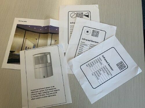
Testers had difficulty interpreting some of the icons and signs. The clearest icons were those that consisted of common symbols (e.g., fingerprints, a camera). More ambiguous symbols (e.g., a happy face, a triangle with bars) and icons with multiple variations or states (e.g., different meanings for a dashed vs. dotted line) were confusing or unfamiliar to testers.
As a result, testers were reliant on the accompanying text descriptions to figure out what the icons meant. However, feedback was split between testers who wanted short descriptions and those who wanted longer, more conversational explanations.
We recommended simplifying the icons and signs by using symbols that are already standard and universally accepted, and finding another way to convey the different variations of a particular function. We also recommended continuing to use text as the main form of communication on the signs, with language that is as accessible and jargon-free as possible.
Finally, groups of signs should be arranged according to a standard hierarchy. The information testers found to be most important was: the purpose of the technology, how residents are benefiting from it, and whether or not the data collected is personally identifiable. Therefore, we recommended instituting a hierarchy that prioritizes this information, which would help the signs communicate more clearly.
Concern about new technologies in the public realm
Acceptance of, and comfort with, new technologies in the public realm varied widely between testers. A few testers said they would be curious at first and eventually get used to it, while others said they wouldn’t care. Concerns were also raised at multiple points during the sessions around what data is collected, how data would be used, who would use it, and who is accountable.
Clearly, there continues to be anxiety about the introduction of new forms of data collection into the public realm. This is an ongoing discussion, but based on the reactions of GRIT testers, residents expected that these new features of public space will come with clear details about the data collection process and purpose, as well as clear lines of accountability.
QR codes are still not mainstream
While all testers were familiar with QR codes and had used them in the past, most said that they currently only use them on rare occasions. Testers felt that QR codes are not yet widespread enough in Canada for them to be adopted enthusiastically.
Nevertheless, testers recognized that QR codes play an important role in this project, as they are a way to access more information about data collection. Testers also felt that QR codes that contained logos of institutions (such as the City of Toronto or Bank of Montreal) conveyed an increased sense of legitimacy.
Purpose of the web app was unclear
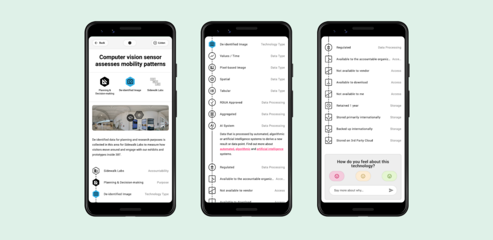
The web app, accessed through the QR codes, is meant to provide more detailed information on how a specific technology is being used and what data is being collected. However, many testers were confused about its purpose. While some understood it was for informational purposes, others thought it was a way to access real-time data from sensors.
This confusion led to uncertainty about how they could interact with the app. Therefore, we recommend communicating the purpose of the web app more clearly.
What GRIT Toronto learned
By their nature, rapid prototyping projects like this move forward and change very quickly. That can pose some problems for rigorous usability testing, such as proctors not having enough time to prepare before the test.
It’s important for proctors to have at least two days to review the testing materials, script and flow, in order to have time to address any questions or concerns that may arise. This is especially true for tests like this one that rely on using printed materials, as they are less conducive to last-minute changes. However, despite these challenges, the rapid prototyping project was able to quickly incorporate the results of the user testing into the next round of design.
Check it out
If you’re interested in diving deeper into the project, Sidewalk Labs has a blog post on how the visual language works here. The first release of the materials, including the icons and design guide, are now available on Github.
This GRIT Toronto usability test was part of a larger collaborative project to imagine what digital transparency in the public realm could be like — you can learn more about the co-design process here.
Interested in working with GRIT Toronto? Join our waiting list to become a participant or even run a test with us. If you have any questions, reach out to Marisa Bernstein at marisa@codefor.ca.


